NAMA Chat
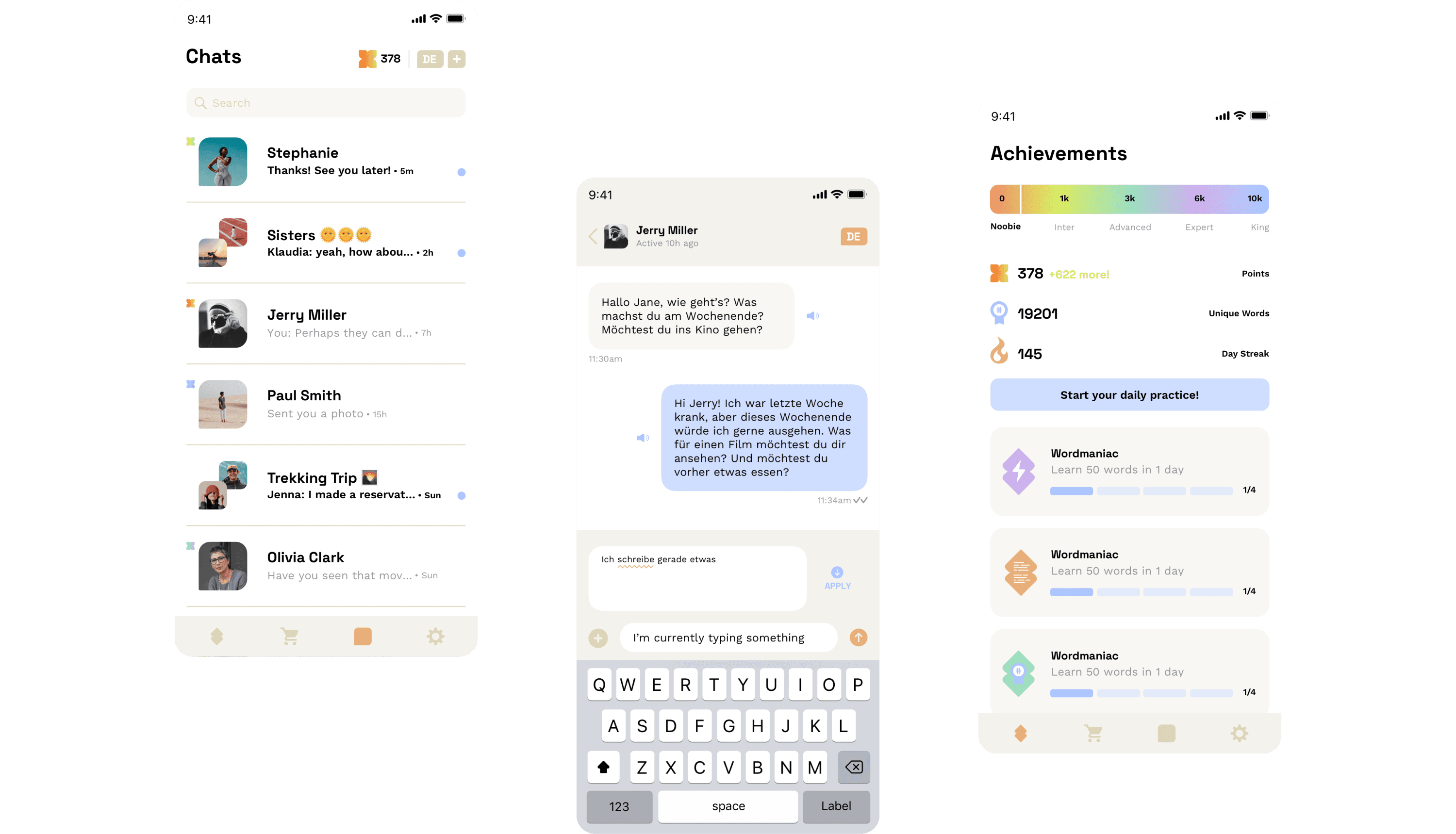
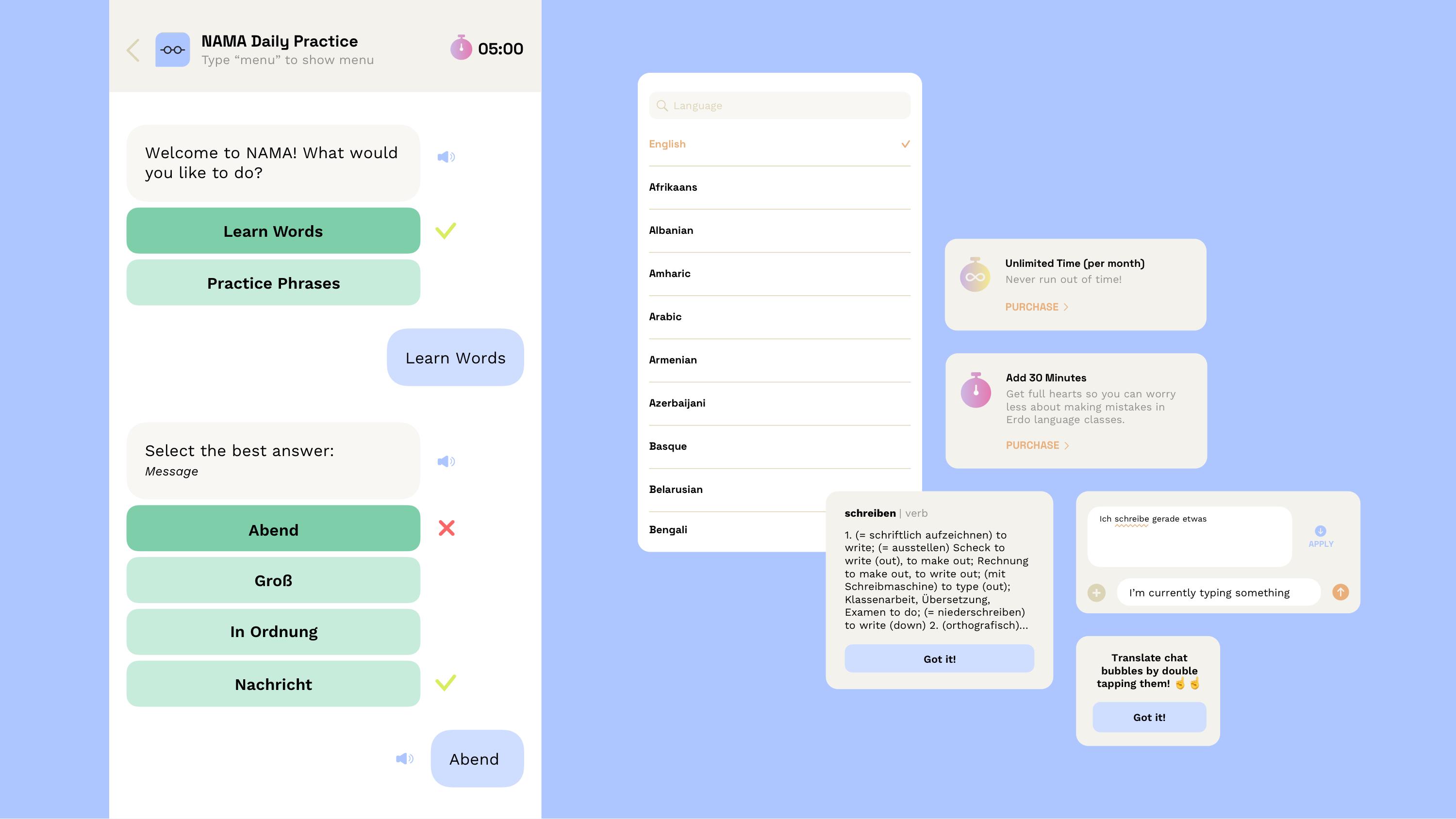
NAMA (Not Another Messaging App) is a messaging platform that allows you to learn a language while doing an activity you already do—chatting with your friends and family! NAMA supports over 100 languages and motivates people to reach their learning goals.
NAMA, launched on Product Hunt, swiftly became the #2 product of the day. Designed to facilitate language learning seamlessly, it offers translation suggestions, auditory feedback, and utilizes spaced repetition for effective learning. With NAMA, you also gain access to the NAMA Keyboard for iOS, enabling language practice across any app. Track and practice learned words and phrases within our main application, unlocking achievements as you progress.
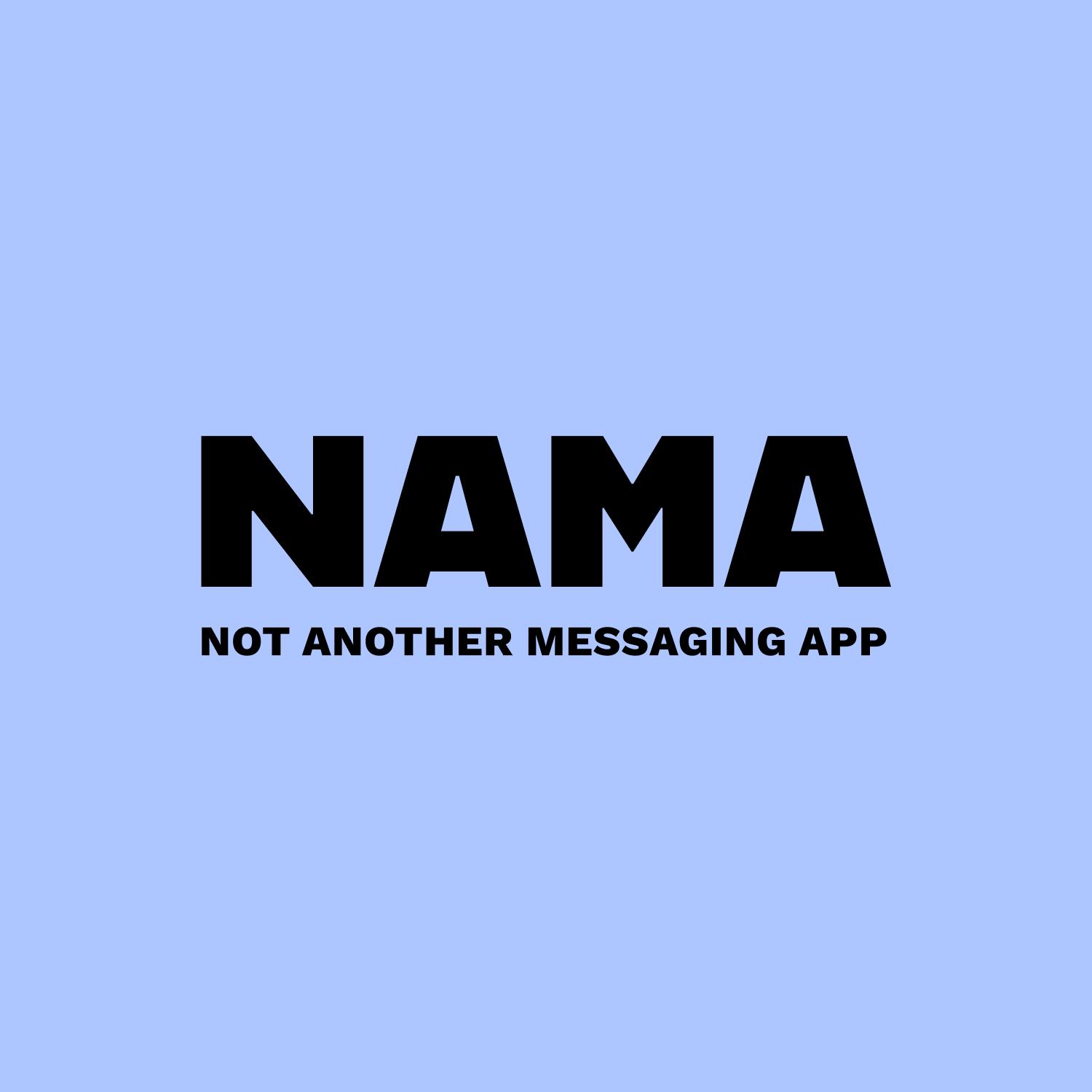
The minimal logo creatively breaks up syllables to echo its pronunciation, featuring a playful speech bubble motif that highlights the app's messaging nature. NAMA's color palette combines muted tones with pops of brightness for a clean, friendly, and approachable appearance. The typography strikes a balance between tech-inspired sleekness and legible clarity.

producthunt.com/products/