mPaper

An internal print and online magazine published by muehlhausmoers annually. Each issue has a unique central theme accompanied with an eye-catching accent color. The magazine is a collection of essays, interviews and visual stories on trends in society, technology and media.
Narcissistic, insecure, aimless, career-oriented, permissive, prude… That's how market researchers, sociologists and journalists describe Generation Y, Generation Z or the entire youth. The mPaper#2 explores young people's shared worldviews, while also examining historical perspectives on the concept of “generation.”
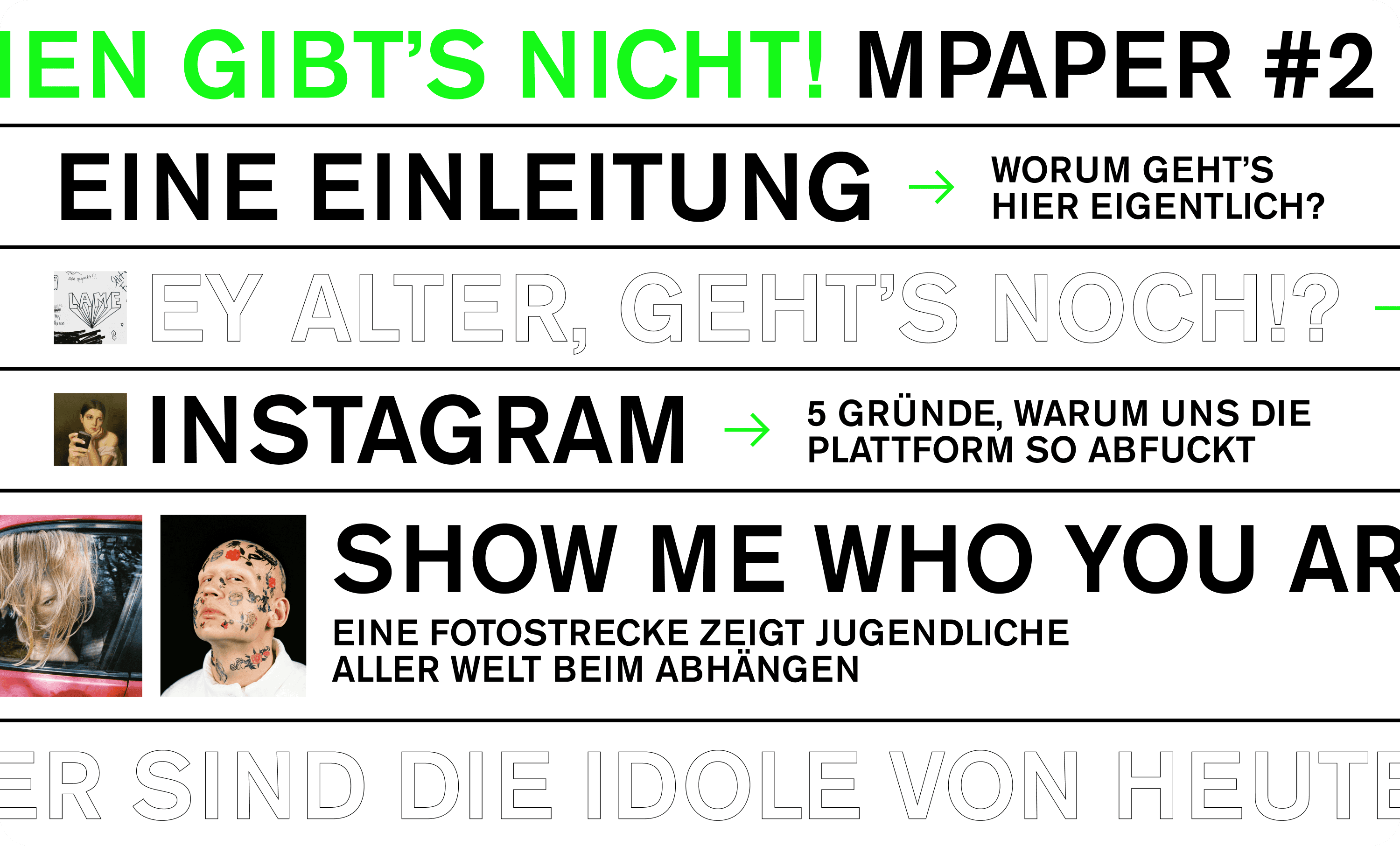
We've designed a set of standard editorial components, serving as the foundation for all of the articles. Yet, each mPaper issue opens up an opportunity to experiment with unconventional editorial formats. This edition introduces an engaging gallery for photography portfolios and an interactive format where readers can interact with the content. The text boxes, playfully arranged in a chaotic yet purposeful manner, symbolize the intricate layers of complexity in the critique of social media platforms.
Social media
mPaper #3?